PT:
De forma minimalista, leve e abstrata, buscamos transmitir no logo:
- O processo; continuidade; de se alimentar de forma mais equilibrada
- A união entre paciente e nutricionista
- O envolvimento que a profissional tem com seus pacientes
- A transformação causada após o processo de reeducação alimentar
- O amor move o mundo e também move o trabalho da Talissa
EN:
In a minimalist, light and abstract way, we seek to convey in the logo:
- The process and continuity of having a more balanced lifestyle
- The union between the patient and the nutritionist
- The involvement that the professional has with her patients
- The transformation caused after the food re-education process
- Love, which moves the world and also moves Talissa's work

PT:
As cores escolhidas adicionam uma atmosfera alegre, extrovertida, leve e aconchegante que se conectam diretamente com o público alvo.
A cor laranja é a que tem mais aroma. É a cor da alegria, calor, energia e da transformação.
Já o verde escuro promove calma, equilíbrio, frescor, bem-estar, saúde e serenidade.
O marrom traz equilíbrio, remetendo à terra, orgânico, saudável.
O tom de bege traz o aconchego e faz a união das cores ser ainda mais harmônica e agradável.
O tom de bege traz o aconchego e faz a união das cores ser ainda mais harmônica e agradável.
EN:
The chosen colors add a cheerful, extroverted, light and cozy atmosphere that connects directly with the target audience.
The orange it is the color of joy, warmth, energy and transformation.
Dark green, on the other hand, promotes calm, balance, freshness, well-being, health and serenity.
Brown brings balance, referring to the earth, organic, healthy.
The beige tone brings warmth and makes the combination of colors even more harmonious and pleasant.

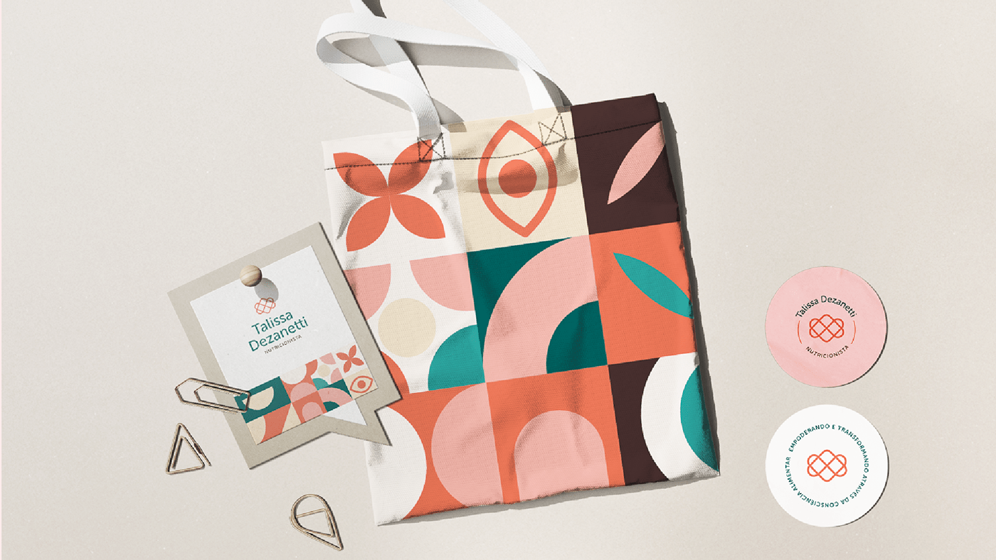
PT:
O padrão geométrico traz um toque divertido, alegre e caloroso para a marca. Buscamos trazer nos elementos:
- O olhar diferenciado da Talissa para a nutrição
- O sorriso de satisfação dos pacientes
- A porta que abre caminho para mudanças e novas possibilidades
- A flor, símbolo da natureza, da vida, bem estar, alimento, energia
- Transformação, conexão, envolvimento, continuidade, movimento
EN:
The geometric pattern brings a fun, cheerful and warm touch to a brand. We seek to convey, in the elements:
- Talissa's differentiated vision at nutrition
- The patient's smile of satisfaction
- The door that opens for changes and new possibilities
- A flower, symbol of nature, life, well-being, food, energy
- Transformation, connection, involvement, movement